


Customize typography, colors, and spacing with variables.

Built with Auto Layout and fluid resizing.

Switch between light and dark themes with one click. Fully tokenized. Fully polished.

Designed for speed, scale, and seamless design flow. Over 10,000 variants crafted for clarity.

Designed for speed, scale, and seamless design flow. Over 10,000 variants crafted for clarity.


Make It Yours
Extend, rename, reshape — without starting from scratch.

6,000+ misc. elements and brand logos. Sharp, consistent, and ready for use.


Switch between light and dark themes with one click. Fully tokenized. Fully polished.


Foundation
Blur
Colors
Gradients
Material
My Logo
Shadow
Spacing
Typography
Utilities
Miscellaneous
AppStore badges
Avatar
Brands Logos
Crypto Logos
Emoji
File Type
Flags
Keyboard
Loading
Payment Card
Press Logos
Profile Images
Social Media Logos
Status
Text Selection
Components
Accordion
Aspect Ratio
Badge
Breadcrumb
Button
Button Tab
Button Tile
Card
Checkbox
Color Selector
Combobox
Dialog
Digit Entry
Dimming Overlay
File Drop
Index Bar
Info Label
Inline Message
Link
List Item
List Menu
List Tree
Page Control
Pagination
Progress Bar
Popover
Progress Indicator
Radio
Segmented Control
Select
Shortcut
Slider
Stepper
Switch
Tag
Text Area
Text Field
Toast
Toolbar
Tooltip
Wells
Patterns
AI features
Chat Input
Action Sheet
Alert Dialog
Collapsible
Context Menu
Code Snippet
Color Picker
Date Picker
Command Search
Search Field
Table
Form
Notification
Navigation Bar
Hover Card
Tab Bar
Panels
Charts
ToolBar
Virtual Keyboard
Skeleton
Blocks
404 Errors
About
Activity Feed
Blog
Contact
Dashboard
Buy/sell
Events
FAQ
Features
Footer
Gallery
Support
Home
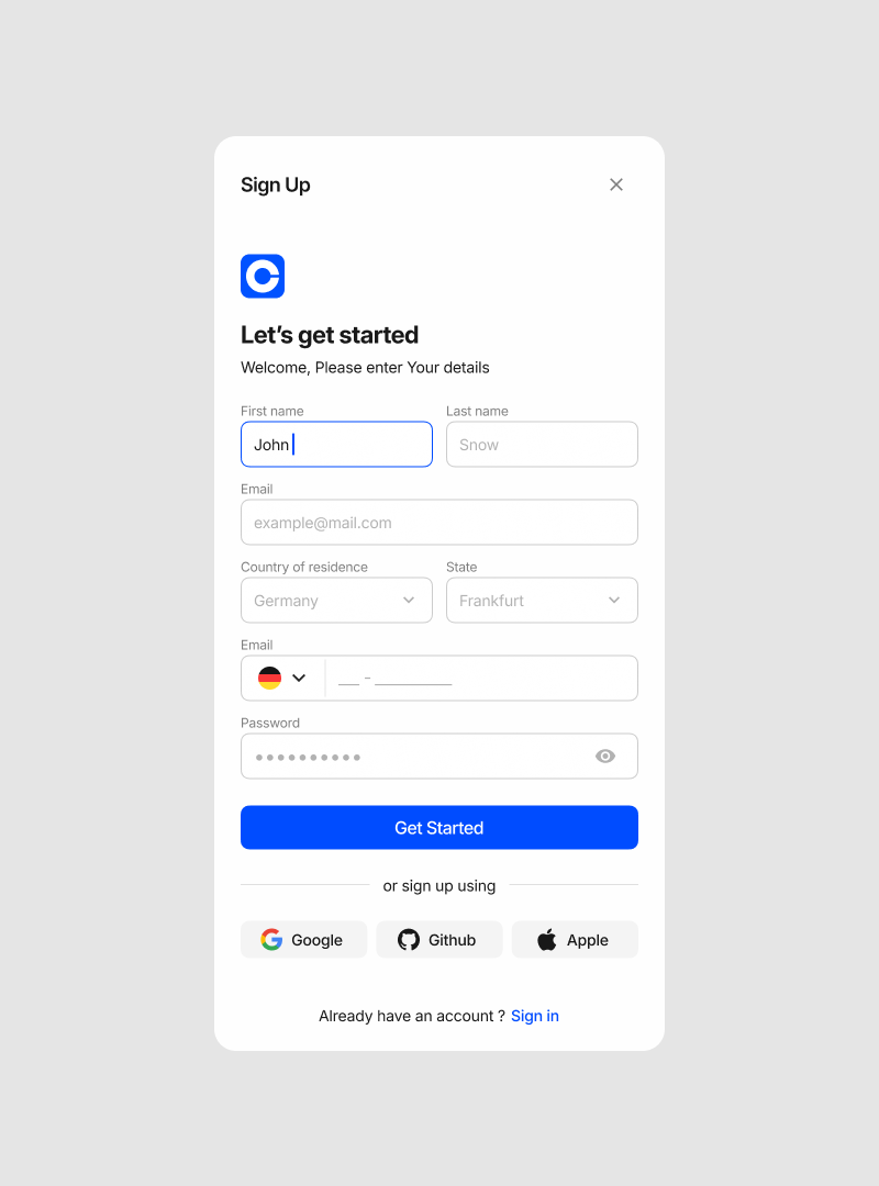
Login
Maintenance
Message Chat
Portfolio
Product
Registration
Report Analytics
Services
Testimonials
User Profile
Templates (Soon)
404 Page
Activity Feed
Blog
Contact Us
Dashboard
E-commerce
FAQ
Features
Gallery
Support
Home
Login/Signup
Portfolio
Product
Services
What is the VOIT Design System?
Does VOIT include the latest Figma features?
Is there a dark mode version?
Is it a one-time payment?
Can I use VOIT for commercial projects?

